Create 2D composition space plots#
For this tutorial, we need matplotlib and compspace obviously, as well as pandas and numpy for loading and manipulating the data.
[1]:
import matplotlib.pyplot as plt
import compspace as cs
import pandas as pd
import numpy as np
Load the example data from a .csv with pandas. We also define a function to create subsets of the constituents. The dataset is a simulated materials library of an 8-component alloy system with 342 individual compositions.
[2]:
# Load example data
comps = pd.read_csv('comp_example.csv', index_col=0)

# Function to create a subset of given constituents
def create_subset(c: pd.DataFrame, constituents: list[str]) -> pd.DataFrame:
    # Create the subset with the given constituents and re-normalize to 100 at.%
    subset = c[constituents]
    return subset.div(subset.sum(axis=1), axis=0) * 100

# Visualize the DataFrame
comps.head()
[2]:
| Cr | Co | Cu | Fe | Mo | Mn | Ni | Ti | |
|---|---|---|---|---|---|---|---|---|
| Index | ||||||||
| 1 | 15.28 | 4.13 | 18.34 | 33.47 | 6.52 | 4.84 | 10.10 | 7.32 |
| 2 | 15.53 | 5.10 | 18.63 | 33.31 | 8.60 | 3.75 | 8.73 | 6.35 |
| 3 | 14.24 | 5.64 | 17.09 | 32.04 | 9.55 | 6.15 | 8.91 | 6.37 |
| 4 | 12.70 | 6.56 | 15.24 | 32.01 | 11.33 | 6.75 | 9.41 | 6.01 |
| 5 | 12.65 | 6.22 | 15.18 | 33.19 | 11.24 | 6.79 | 8.15 | 6.59 |
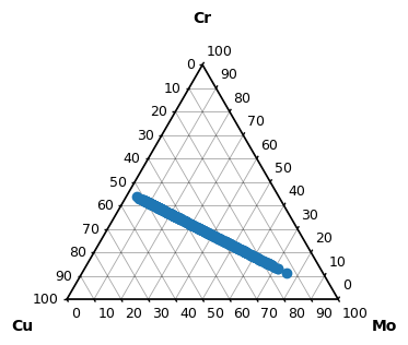
We start by plotting a ternary subset of the data. The composition space plot can be created by passing compspace2D as a matplotlib projection when creating a new figure. The elements (columns in the DataFrame) are automatically added as axis labels.
[3]:
# Create a ternary subset
ternary_subset = create_subset(comps, ['Cr', 'Cu', 'Mo'])

# Create a figure with a ternary projection
fig, ax = plt.subplots(figsize=(4, 4), subplot_kw={'projection': 'compspace2D'})
# Scatter the data points
sc = ax.scatter(ternary_subset)
# Show the plot
plt.show()
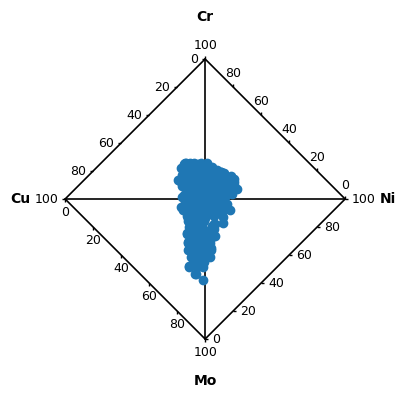
For ternary and quaternary compositions, the grid and ticks are automatically added. This can be changed by ax.set_grid() and ax.set_ticks() respectively. For higher constistuents, these are disabled by default to avoid cluttering the plot, but are also available. Let’s plot a quaternary subset and hide the grid and set different ticks.
[4]:
# Create a quaternary subset
quaternary_subset = create_subset(comps, ['Cr', 'Cu', 'Mo', 'Ni'])
# Only show ticks every 20 at. %
ticks = np.arange(0, 101, 20)

# Create a figure with a quaternary projection, the projection is still 'compspace2D'
fig, ax = plt.subplots(figsize=(4, 4), subplot_kw={'projection': 'compspace2D'})
# Scatter the data points
sc = ax.scatter(quaternary_subset)
# Hide the grid
ax.set_grid(False)
ax.set_ticks(ticks=ticks)
# Show the plot
plt.show()
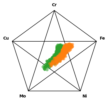
Other parameters of ax.scatter are forwarded to the underlying matplotlib scatter function. For example, we can change the color and alpha of the markers. Below, this is shown for a quinary subset. Of course, also multiple composition sets can be plotted in the same composition space.
[5]:
# Create a quinary subset
quinary_subset_1 = create_subset(comps, ['Cr', 'Cu', 'Mo', 'Ni', 'Fe'])
# Create a second quinary subset by doubling the Fe content
quinary_subset_2 = quinary_subset_1.copy()
quinary_subset_2['Fe'] = quinary_subset_2['Fe'] * 2
quinary_subset_2 = quinary_subset_2.div(quinary_subset_2.sum(axis=1), axis=0) * 100

# Create a figure with a quinary projection
fig, ax = plt.subplots(figsize=(4, 4), subplot_kw={'projection': 'compspace2D'})
# Specify the color and alpha of the markers
sc1 = ax.scatter(quinary_subset_1, c='tab:green', alpha=0.5)
sc2 = ax.scatter(quinary_subset_2, c='tab:orange', alpha=0.5)
# Show the plot
plt.show()
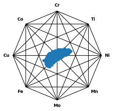
The package supports plotting up to octonary (8-element) composition spaces. Let’s plot the entire dataset with all 8 constituents to end the tutorial.
[6]:
# Create a figure with an octonary projection
fig, ax = plt.subplots(figsize=(4, 4), subplot_kw={'projection': 'compspace2D'})
# Scatter the data points
sc = ax.scatter(comps)
# Show the plot
plt.show()